

Google uses the mobile version of a site’s content, crawled with its smartphone agent, for indexing and ranking. It calls this mobile-first indexing. Google’s documentation, last updated in December 2025, says a mobile version is not required for content to be included in Search, but is very strongly recommended. This checklist follows that page.
Start with the design pattern
Google describes three setups: responsive design, dynamic serving and separate mobile URLs. It recommends responsive design as the easiest to implement and maintain. With responsive design the same HTML and metadata are served to every device, so most of the checks below are already satisfied. The detailed advice in the guide applies to dynamic serving and separate URL setups. If your blog uses a modern responsive theme, focus on the first two checks and the lazy-loading warning.
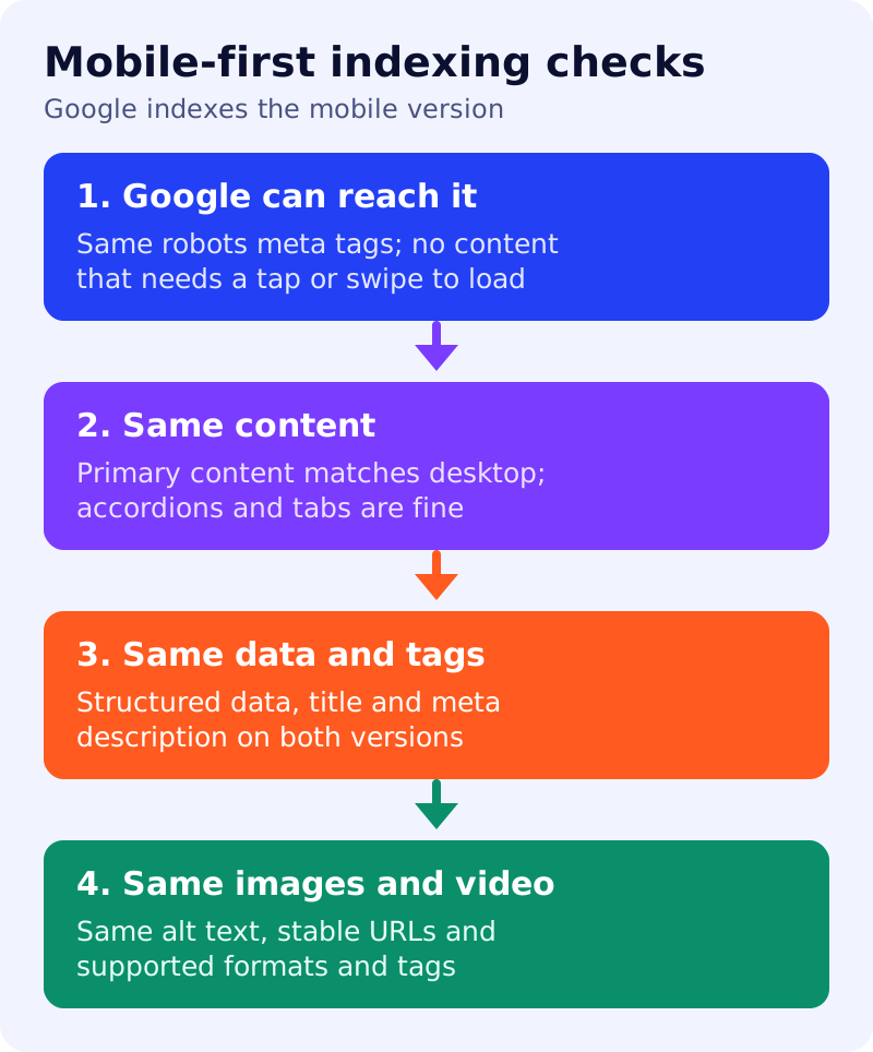
Check 1: can Google reach the page?
- Use the same robots meta tags on mobile and desktop. Google warns that a different tag on the mobile site, especially noindex or nofollow, may stop the page being crawled and indexed once mobile-first indexing applies.
- Do not lazy-load primary content upon user interaction. Google says it will not load content that needs swiping, clicking or typing.
- Do not block mobile resources with a disallow rule if you want Google to crawl them. See robots.txt for a blog.
Check 2: is the content the same?
Google says differences in layout can change how it understands content, and that equal content lets both versions rank for the same keywords. If the mobile page has less content, expect some traffic loss. Moving content into accordions or tabs is acceptable, and Google suggests it instead of removing content. Use the same clear headings on both versions.
Check 3: are data and tags the same?
Structured data should be present on both versions. If you must prioritise, Google names Breadcrumb, Product and VideoObject first. URLs inside structured data on mobile pages should be the mobile URLs. The title element and meta description should also be equivalent. See snippets and meta descriptions.
Check 4: images and video
Use high-quality images in supported formats, keep the same alt text, captions and file names as desktop, and avoid image or video URLs that change on every page load. Google notes that using different image URLs on mobile can cause a temporary image traffic loss, so using the same URLs avoids it. Videos should use supported tags and sit in an easy-to-find place on the mobile page.
If you use separate mobile URLs
Google adds specific advice: keep error status the same on both versions, avoid URL fragments on mobile URLs, make sure each desktop page has an equivalent mobile page rather than redirecting several to one page, and verify both versions in Search Console. Check hreflang links as well.
What to do
- Identify your setup. Responsive, dynamic serving or separate URLs?
- Compare one long post on a phone and a desktop. Is any primary text, image or table missing on mobile?
- Check robots meta tags and that no content waits for a tap to load.
- Compare structured data and the title and description in both views.
- Keep image URLs and alt text identical.
The mobile page is the one Google reads, so treat it as the main version.
Source: Google Search Central documentation, as linked above.